iOS design guide
A cheat sheet of screen sizes, scale factors and Human Interface Guidelines for designing iPhone and iPad apps.
A guide of standard practices, official guidelines(HIG) for designing iOS/iPadOS applications.
This cheat sheet is mainly an attempt to keep track of wide variety of devices and their design constraints that are updated regularly.
Display Specifications
iPhone Models:
| Device | Size | PPI | Scale Factor | Retina Display Name | Portrait Resolution (points) | Portrait Resolution (pixels) |
|---|---|---|---|---|---|---|
| iPhone XS Max, iPhone 11 Pro Max | 6.5″ | 458 | @3x | Super Retina HD Display | 414 x 896 points | 1242 x 2688 px |
| iPhone XR, iPhone 11 | 6.1” | 326 | @2x | Liquid Retina HD Display | 414 x 896 points | 828 x 1792 px |
| iPhone X, iPhone XS, iPhone 11 Pro | 5.8” | 458 | @3x | Super Retina HD Display | 375 x 812 points | 1125 x 2436 px |
| iPhone 6 Plus, iPhone 6S Plus, iPhone 7 Plus, iPhone 8 Plus | 5.5” | 401 | @3x | Retina HD Display | 414 x 736 points | 1080 x 1920 px |
| iPhone 6, iPhone 6S, iPhone 7, iPhone 8 | 4.7” | 326 | @2x | Retina HD Display | 375 x 667 points | 750 x 1334 px |
| iPhone 5, iPhone 5S, iPhone 5C, iPhone SE | 4.0” | 326 | @2x | Retina Display | 320 x 568 points | 640 x 1136 px |
| iPhone 4, iPhone 4S | 3.5″ | 326 | @2x | Retina Display | 320 x 480 points | 640 x 960 px |
| [Legacy] iPhone/iPod Touch (1, 2, 3rd gen) | 3.5″ | 163 | @1x | - | 320 x 480 points | 320 x 480 px |
iPad Models:
| Device | Size | PPI | Scale Factor | Retina Display Name | Portrait Resolution (points) | Portrait Resolution (pixels) |
|---|---|---|---|---|---|---|
| iPad Pro 12.9-inch (1, 2, 3rd gen) | 12.9” | 264 | @2x | Retina Display, Liquid Retina Display(3rd gen) | 1024 x 1366 points | 2048 x 2732 px |
| iPad Pro 10.5, iPad Air 10.5 | 10.5” | 264 | @2x | Retina Display | 834 x 1112 points | 1668 x 2224 px |
| iPad 10.2-inch (7th gen/2019) | 10.2” | 264 | @2x | Retina Display | 810 x 1080 points | 1620 x 2160 px |
| iPad 3, iPad 4, iPad Air, iPad Air 2, iPad Pro 9.7-inch, iPad 5th, iPad 6th | 9.7” | 264 | @2x | Retina Display | 768 x 1024 points | 1536 x 2048 px |
| iPad (1st, 2nd gen) | 9.7” | 132 | @1x | - | 768 x 1024 points | 768 x 1024 px |
| iPad Mini (2nd, 3rd, 4th, 5th gen) | 7.9″ | 326 | @2x | Retina Display | 768 x 1024 points | 1536 x 2048 px |
| iPad Mini 1st Generation | 7.9″ | 163 | @1x | - | 768 x 1024 points | 768 x 1024 px |
Apple Watch Models:
| Device | Size | PPI | Scale Factor | Retina Display Name | Portrait Resolution (points) | Portrait Resolution (pixels) |
|---|---|---|---|---|---|---|
| Watch 38mm | 1.32” (34 mm) | 326 | @2x | Retina Display | 136 x 170 points | 272 x 340 px |
| Watch 42mm | 1.54” (39 mm) | 326 | @2x | Retina Display | 156 x 195 points | 312 x 390 px |
| Watch 40mm | 1.57” (39 mm) | 326 | @2x | Retina Display | 162 x 197 points | 324 × 394 px |
| Watch 44mm | 1.73” (44 mm) | 326 | @2x | Retina Display | 185 x 224 points | 368 × 448 px |
App Icons
Let’s pick the guidelines directly from the latest(11.3.1) Xcode’s storyboard.
| Type | Size | Supported iOS Version | Assets |
|---|---|---|---|
| iPhone Notification | 20pt | iOS 7-13 | 2x, 3x |
| iPhone Settings | 29pt | iOS 7-13 | 2x, 3x |
| iPhone Spotlight | 40pt | iOS 7-13 | 2x, 3x |
| iPhone App icon | 60pt | iOS 7-13 | 2x, 3x |
| iPad notifications | 20pt | iOS 7-13 | 1x, 2x |
| iPad Settings | 29pt | iOS 7-13 | 1x, 2x |
| iPad Spotlight | 40pt | iOS 7-13 | 1x, 2x |
| iPad App icon | 76pt | iOS 7-13 | 1x, 2x |
| iPad Pro (12.9”) App icon | 83.5pt | iOS 9-13 | 2x |
| App Store | 1024pt | All versions | 1x |
Common Layout Guidelines
Status Bar:
A status bar always extends to full width of the device. However, since the introduction of iPhones with notches, status bar was redesigned to facilitate the notch design.
Note: Don’t replace systemwide status bar with a custom one.
Available styles:
- Light (black icons on a white background)
- Dark (white icons on a black background)
| Device | Status Bar Height |
|---|---|
| iPhone with bezel | 20pt |
| iPhone with notch | 44pt |
| iPad Pro | 24pt |
| iPad with bezel | 20pt |
Navigation Bar:
A navigation bar is typically placed right below the status bar on iOS designs. Unlike status bar, you can customize this or adopt a different approach to navigation in your designs.
A new navigation bar style with large title was made available from iOS 11 onwards.
Following are the height values (excluding status bar height) for different states of navigation bar.
| Navigation State | Height |
|---|---|
| Default navigation bar (portrait) | 44pt |
| Large title navigation bar | 44pt + 52pt |
| Navigation bar on iPhone (landscape) | 32pt |
| iPad (iOS 12+) | 50pt |
| Large title navigation bar on iPad (iOS 12+) | 50pt + 52pt |
Search Bar:
A search bar can be displayed alone, or in a navigation bar or content view.
And, the dimensions of search bar remain same in all the cases unless we decide to use an additional feature – a label further explaining functionality of search bar.
| Search Bar Type | Height |
|---|---|
| Search bar without introductory text | 51pt |
| Search bar with introductory text | 82pt |
Tab Bar:
A tab bar is another type of approach to navigation inside the app.
Note: Use Tab Bars strictly for navigation purpose only. Check Toolbars for other purposes.
After Apple removed the physical home button and introduced a home indicator bar at the bottom, consider home indicator height in your designs.
However, as a developer, you might want to read about Safe Area in Autolayout to avoid overlapping of home indicator over your app’s content.
| Tab Bar Type | Height |
|---|---|
| Tab Bar without home indicator | 49pt |
| Tab Bar with home indicator | 49pt + 34pt |
| Tab Bar without home indicator iOS 12+ (iPad) | 50pt |
Iconography
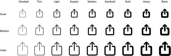
With iOS 13, Apple released SF Symbols to match the new San Francisco system font. If you need a symbol that isn’t provided by SF Symbols, you can create your own.
Icon Sizes
| Icon Type | Size (@1x) |
|---|---|
| Toolbar and Navigation Bar Icon | 22 x 22 px |
| Tab Bar Icon | 25 x 25 px |
Typography
| Font Family | Default system font |
|---|---|
| Helvetica Neue | iOS 8 and below |
| San Francisco | iOS 9+ |
| Element | Size (pt) | Weight |
|---|---|---|
| Navigation bar title | 17 | Semibold |
| Large navigation bar title | 34 | Bold |
| Buttons | 17 | Regular |
| Search Bar | 17 | Regular |
| Tab bar icon labels | 10 | Regular |
| Table Row sublabel | 15 | Regular |
| Table header | 13 | Regular |
| Table Row | 17 | Regular |
| Table Footer | 13 | Regular |
| Action Sheets | 20 | Regular/ Semibold |
Referrences
I’ve managed to put this together for personal use as per my need using following useful links: